Product specs and guidance
Display network retargeting
1. Minimum requirements
It is best practice to supply all eight banner sizes, but the mandatory display ad sizes are:
- 300 x 250 - Medium rectangle
- 336 x 280 - Large rectangle
- 728 x 90 - Leaderboard
Accepted display ads
- Leaderboard - 728 x 90px
- Medium rectangle - 300 x 250px
- Large rectangle - 336 x 280px
- Square - 250 x 250px
- Small square - 200 x 200px
- Banner - 468 x 60px
- Skyscraper - 120 x 600px
- Wide skyscraper - 160 x 600px


2. Creative specs
These can be animated or non-animated GIF*, JPG, or PNG Files.
* NB: Animated ads (GIF). Animation length and speed:
- Animation length must be 30 seconds or less
- Animations can be looped, but the animations must stop after 30 seconds
- Animated GIF ads must be slower than 5 FPS
- Maximum file size: 150Kb
3. Best practices
- Supply all the recommended display ad sizes in the correct format.
- For longer campaign durations, ensure creatives are replaced every three months. We recommend fresh creatives at least every 6 to 12 weeks for always-on campaigns. Think about the decision making process of your target audience and use creative to help them along that journey by regularly replacing with relevant creative and messaging. Include considerations for seasonality in long duration campaigns.
- Ensure the message and creative resonates with your target audience. The audience should 'see themselves' in your ad.
- Do ensure creative is relevant to your landing page - what the ad say it is about in the banner, should click through to a page that says more about this and a CTA button should be easily identifiable on the landing page.
Signals Display
1. Minimum requirements:
- Landing page URL: Required + include any UTM / Tracking templates
- Banners:
Image Sizes:
Minimum required mobile sizes:
- 300x50
- 320 x100
Minimum web required banner sizes:
- 300 x 250
- 728x90
The below are other optional sizes but not required, the more sizes provided the more opportunity your ads have to display in available inventory placements:
- Square and rectangle: 250 × 250, 320 × 320, 336 × 280
- Skyscraper: 120 × 600, 160 × 600, 300 × 600, 300 × 1050
- Leaderboard: 468 × 60, 800 × 250, 970 × 90, 970 × 250
- Mobile: 300 × 100, 360 × 592, 360 × 640, 375 × 667, 320 x 480, 320x50
2. Creative specs:
- File types: JPG, GIF, PNG, HTML5*
- Dimensions: No larger than 4000 × 4000 pixels
- File size: No larger than 10 MB, but publishers may require smaller file sizes
- Animations: Must be under 30 seconds, 3 rotations
*We can also accept HTML5 Banner formats, when supplied they are required to follow these (Guidelines for HTML5 display creatives - Display & Video 360 Help (google.com)) guidelines. Support is not provided to amend these. The required image sizes must still be supplied in HTML5 format.
We are also able to accept third-party display tags such us tags from Campaign Manager 360 - it is still advisable to follow the Image and Best practices guidance here in your creative even when supplying tags. We can accept tags from any major ad server (Supported third-party ad servers - Display & Video 360 Help (google.com))
3. Best practices:
Always follow the IAB Guidelines (Guidelines Archive (iab.com))
- Use High Quality Creative To make sure images look great on any device, including high resolution screens, upload image assets that are up to twice the dimensions of your creative. Signals scales images based on the resolution of the device where your ad appears. For example: Provide a 600 x 500 size image for a 300 x 250 banner size and it will scale to a high quality medium rectangle.
- Always ensure you have included the required mobile banner sizes. Approximately 60% of global web traffic is produced by people accessing the web through mobile devices. On average, 55% of users visit Prospects on mobile devices.
- Include a CTA on the third rotation To entice an audience to click, CTA's should be powerful and tell the user exactly what action to take and what to expect when they click. Ensure your messaging approach is in line with your objectives and KPIs.
- DO NOT include URLs in banner messaging
- DO ensure your landing page matches the expectation given to the user through the messaging and CTA.
- DO NOT use custom built PPC landing pages for display advertising.
The natural behaviour of audiences are not always to click on a banner ad and take an action immediately. Most times users will view the page and return later through search either on a search engine on your website. Users like to explore before taking immediate action. If these are custom PPC pages, they cannot be found again and make measuring the success of your campaigns difficult and provide a poor user experience.
Youtube video retargeting
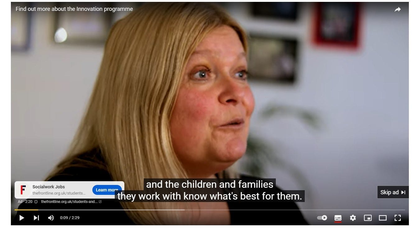
1. Minimum requirements
- Link to your chosen video content hosted on your Youtube channel
- Tracking link for the destination URL
2. Best practices
The video must be relevant and engaging, representing the best you have to offer in 10 to 15 seconds. The first 7 seconds of the chosen video are key to make the impact. Gen Zs are said to be most responsive in the first few seconds of a clip, so make sure your video makes the best first impression and goes straight to the point.
Facebook or Instagram advertising
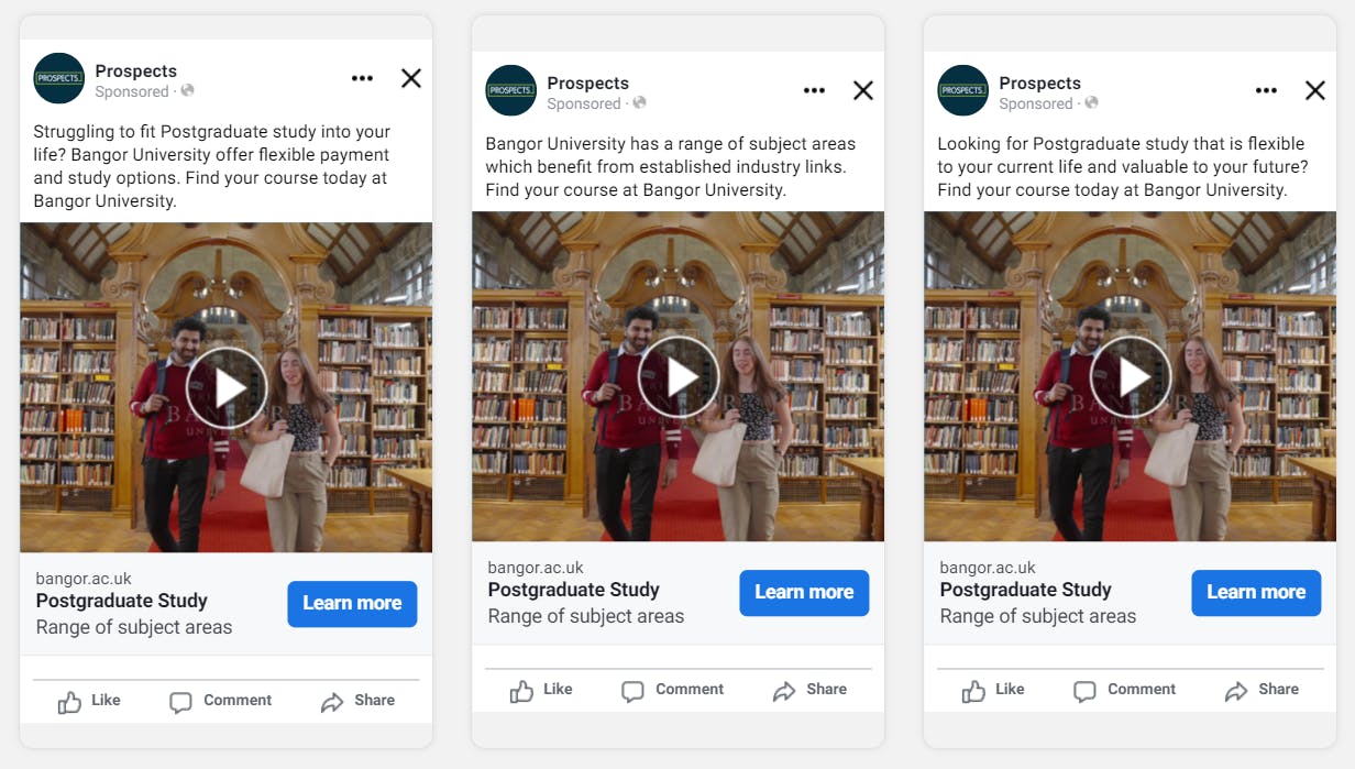
1. Minimum requirements
- Start and end date
- Primary text (less than 125 characters)
- Include up to three headlines (less than 27 characters)
- Description (less than 27 characters). It will only display if headlines are less than 20 characters long
- Call to action
- Destination URL
- Audience (AHS Number/Web Page URLs)
- Suitable creative assets
2. Creative specs
Image
- Square image: 1080x1080px (1:1)
- Vertical image: 1080x1920px (9:16)
- File type: JPG or PNG
- Maximum file size: 30 MB
- Minimum dimensions: 1080x1080 pixels
Video
Video specs
- Ratio: 1:1 and 4:5
- Resolution: At least 1080 x 1080 pixels
- File type: MP4, MOV or GIF
- Video duration: 1 second to 15 seconds
- Maximum file size: 4 GB
3. Best practices
Make use of a variety of creative and copy to ensure your audience stays intrigued. Supply up to three text options and up to three headlines which can be algorithmically rotated to reduce ad fatigue by finding best match combinations that resonate with your audience. Each creative should have a powerful visual and message that speaks to the motivation points of your audience.
Copywriting guidelines:
1. Primary text (125 characters or less). This goes above the main image when displayed in the news feed.
- Include company name, benefits and opportunities to express the value of clicking through.
- Highlight urgency when appropriate - time prompts like 'now' or 'closing soon' encourage action
- Ask questions to engage audience where possible
2. Headline (24 characters or less). This goes on the bottom of the image - contrary to its technical name it does not display at the top. These are great for highlighting closing dates or a fantastic benefit such as 'Excellent pension scheme'.
- Catch the attention - make it short and clear.
3. Description (30 characters or less). This goes below the headline and often does not display. This should only be used for sub text or less important information. Contrary to its technical name, it is not the body text.
- Refrain from repeating information contained in the artwork in the copy.
- The artwork should be bold and eye catching, and represent the audience you want to target.
- Key words and/or creative elements should be reflected on the landing page to help the user search for the information they want more of and to
- reassure them that the page is providing further information to the ad seen.
Visual elements:
- Please supply creative purposely created for social media and various forms including Instagram and Facebook feeds, reels and stories.
- Ensure creatives are HD, clean and simple.
- Ensure logo is included in your creative.
- Refrain from using stock images.
- Short form video performs particularly well, make sure these catch the attention of your audience within its first seconds.
Copy workbook
Try this Facebook or Instagram Advertising Workbook to draft your copy.
Display website advertising on Prospects
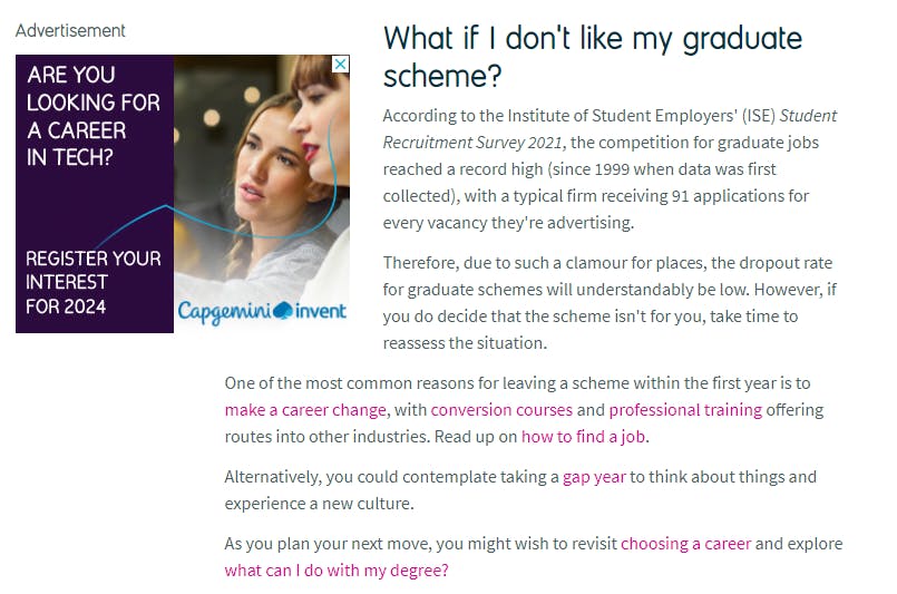
1. Minimum requirements
- Logo in correct format
- Banner in correct format
- Targeted pages
- Targeted impressions
- Start and end date
- Destination URL
2. Creative specs
Logo:
Minimum dimensions:
- Square: 110 x 110 pixels
- Portrait: 80 x 150 pixels
- Landscape: 170 x 70 pixels
- Max file size: 100k
- 72ppi resolution
- File type: .JPG, .GIF or .PNG format
- No animation allowed
- Logos must be one of the dimensions shown
Online banner advertising:
- Minimum dimensions: 300 x 250 (MPU)
- Width x height: 300 x 250 pixels
- File types: JPG, GIF, PNG, JavaScript
- Max file size: 45k; 15sec Duration
- Disallowed file formats: Shockwave, Flash, Java applets
- All external URLs used within display advertising tags must reference a secure server. Any absolute URLs used that start with 'http://' instead of 'https://' will cause the creative to deliver incorrectly.
3. Best practices
- Do ensure creative is relevant to your landing page.
- If the aim of your campaign is to drive response, include appropriate calls to actions. Funding information and studentships work great for institutions.
- Choose a colour palette that fits with your brand but also with your product/service.
- Ensure text is instantly readable.
- Above all keep it simple. Avoid too many distractions and only use images where appropriate.
- Analyse your previous banner campaigns to get insight into what works well for your company/institution.
- Keep files small so the banner loads quickly.
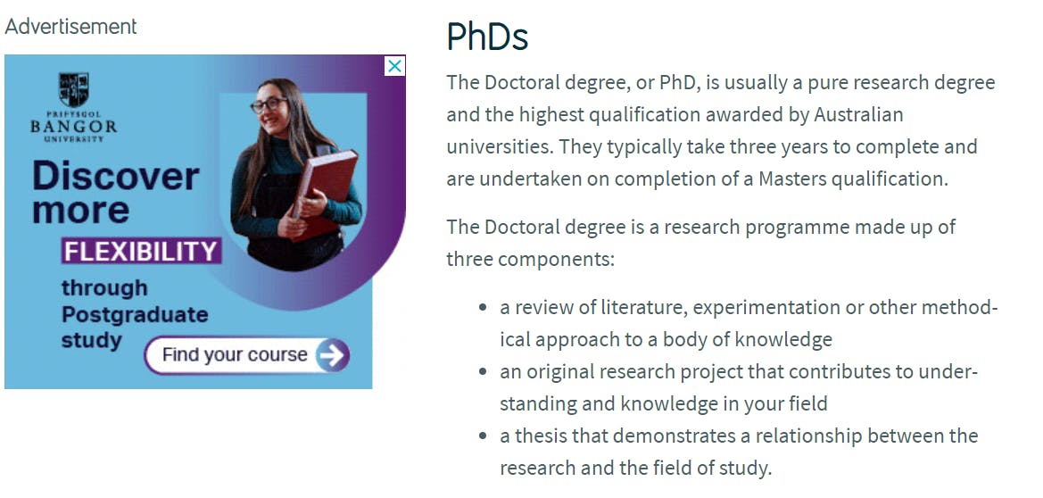
Employer profile
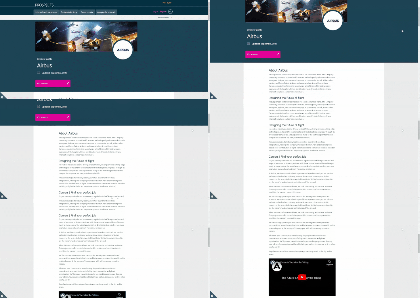
1. Minimum requirements
- Start and end date
- Destination URL
- Profile copy provided by a submission form
- Logo
- Masthead (optional)
- In content Images
Optional:
- Link to in-content YouTube video - must be uploaded and set to public
2. Creative specs
Logo:
- Max file size: 100K
- File type: GIF/ .JPG
- Width x height: 110x110 pixels
Masthead:
- Max file size: 200K
- File type: .JPG, .GIF, .PNG
- Exact width x height required: 1140x300 pixels
Images:
- Max file size: 200K
- Exact width required: 620 pixels
- Cannot contain text
- Must not be transparent
3. Best practices
Copywriting guidelines:
- Profile copy should be less than 1000 words.
- The profile should serve as a gateway to your website. We advise you to provide the reader with enough information to entice them to click to your site but not too much detail that overwhelms them and they lose interest.
- Appeal to wider motivations and talk about company ethos, work environment and social activities
Visual elements:
- Great for branding so make sure to include masthead, links and images.
- Masthead must not contain text content.
- Add a Youtube video within your listing. Video content is key to successfully reach Gen Z demographic.
- Opt for short-form video to appeal to Gen Z demographic.
Copy workbook
Try this Employer Profile Workbook to draft your copy.
Institution/department profile

1. Minimum requirements
- Start and end date
- Destination URL
- Profile copy provided by a submission form
- Logo
- Masthead (optional)
- In Content Images
Optional:
- Link to in-content YouTube video - must be uploaded and set to public
2. Creative specs
Logo:
- Max file size: 100K
- File type: GIF/ .JPG
- Width x height: 110x110 pixels
Masthead:
- Max file size: 200K
- File type: .JPG, .GIF, .PNG
- Exact width x height required: 1140x300 pixels
Images:
- Max file size: 200K
- Exact width required: 620 pixels
- Cannot contain text
- Must not be transparent
3. Best practices
Copy guidelines:
- Profile copy should be less than 1,000 words.
- The profile should serve as a gateway to your website. We advise you to provide the reader with enough information to entice them to click to your site but not too much detail that overwhelms them and they lose interest.
Visual elements:
- Great for branding so make sure to include masthead, links and images.
- Masthead must not contain text content.
- Add a Youtube video within your listing. Video content is key to successfully reach Gen Z demographic.
- Opt for short-form video to appeal to Gen Z demographic.
Copy workbook
Try this Institution or Department Profile Workbook to draft your copy.
Job listings
1. Minimum requirements:
- Job title
- Start and end date
- Closing date
- Destination URL /Verfified apply email
- Job listing copy attached
- Type of listing stated
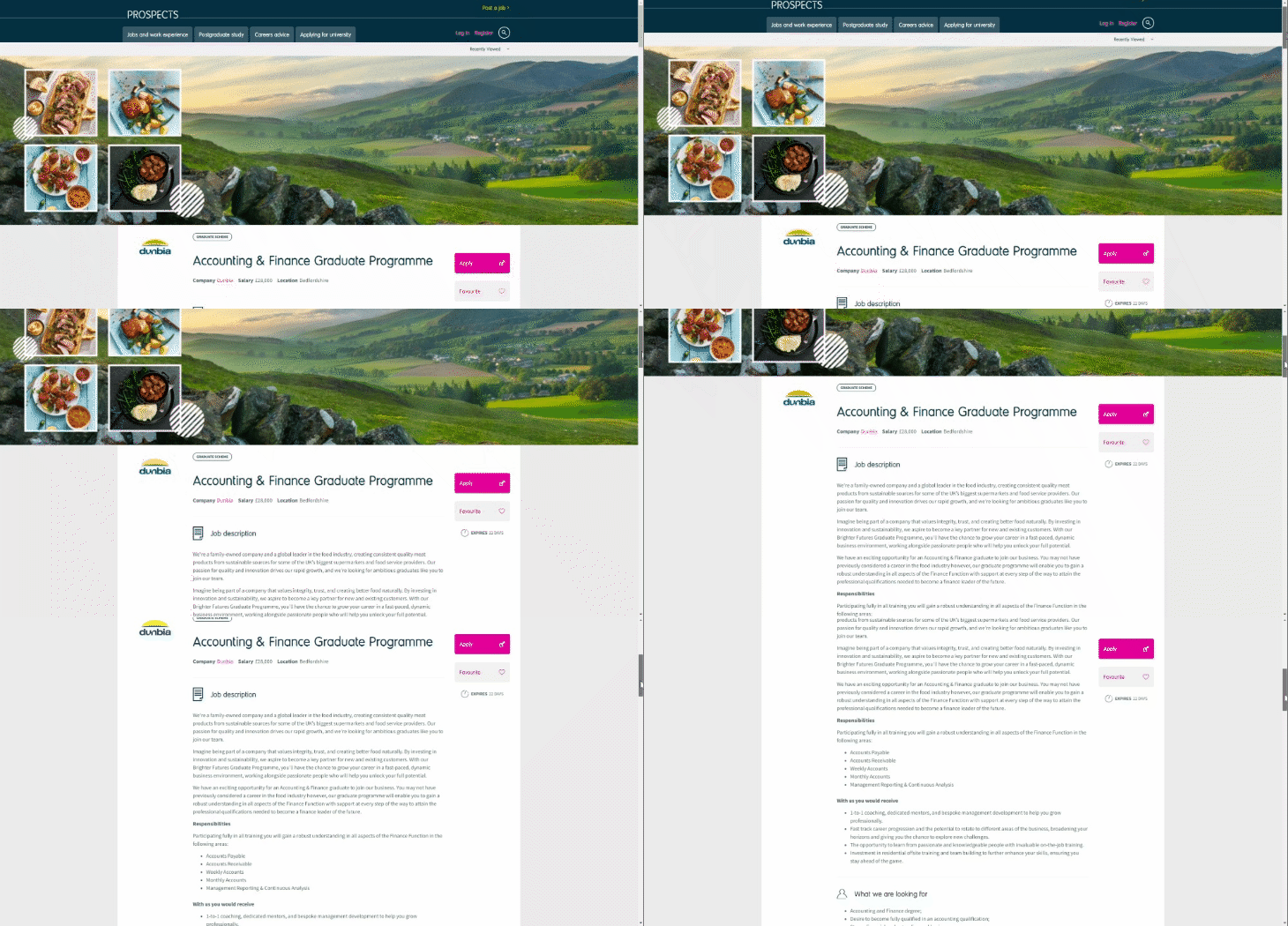
- Logo
- Masthead (optional)
2. Creative specs:
Logo:
- Max file size: 100K
- File type: .GIF/ .JPG
- Width x height: 110x110 pixels
Masthead:
- Max file size: 200K
- File type: .JPG, .GIF, .PNG
- Exact dimensions required: 1140x300 pixels
- Cannot contain text
- Must not be transparent
3. Best practices
Copywriting guidelines:
1. Job Title
- Opt for job titles that are descriptive and indicative of the role's nature (e.g., 'Graduate Research Executive').
- Avoid cluttering the title with location or company details; keep it succinct to entice readers to explore further.
2. Location
- Clearly specify the city or town where the job is located to give potential applicants a clear understanding of the work location.
- In cases where the role is in a remote or lesser-known area, provide information about nearby landmarks or major cities to help candidates gauge the location's accessibility.
3. Salary
- Present the actual salary figure rather than vague terms like 'competitive' or 'paid'.
- If exact figures are not feasible, consider using a salary band to provide a clear range of potential compensation.
- Transparency in salary information encourages more serious applicants and helps manage expectations.
4. Job description
- Craft a comprehensive job description that outlines the key responsibilities and activities of the role.
- Emphasise the role's purpose within the organization and its relevance to the company's objectives.
- Avoid using technical jargon that might confuse potential candidates; clarity is crucial.
- Mention any training or development opportunities that will be provided to help candidates adapt quickly.
5. Company information
- Leverage this section to showcase the company's strengths and successes.
- Highlight recent achievements, innovations, or market distinctions that make the company stand out.
- Articulate the organisation's long-term vision to attract candidates who align with its goals.
- Convey the company's unique culture, values, and workplace environment to make it an appealing place to work.
6. Person requirements
- Specify academic and skill prerequisites clearly.
- Indicate whether a particular degree is mandatory and if a certain level of academic achievement (e.g. 2:1) is required.
- Additionally, detail any soft skills, experience, or specific qualifications that are integral to succeeding in the role.
7. Benefits
- Go beyond salary and outline supplementary perks that come with the role.
- Highlight benefits like performance bonuses, generous holiday allowances, pension plans, health schemes, and any other unique offerings.
- These additional benefits can significantly influence a candidate's decision to apply and join the organisation.
8. Additional details
- Specify the nature of the employment, whether it's a permanent position or a fixed-term contract.
- Communicate the anticipated start date to provide applicants with a timeline.
- If multiple openings are available, indicate the number of positions being recruited for.
- Explain the application process steps, including any assessments, interviews, or other evaluations involved.
9. Apply
- Provide a clear and accessible application method.
- If utilizing your own application system, offer the specific URL leading to the vacancy listing page to streamline the application process.
- If using an external system, provide a dedicated email address for submitting CVs, and consider including a filter question to ensure applicants meet initial eligibility criteria.
- For accurate tracking, utilize tracking links to monitor the effectiveness of the advertisement.
Visual elements:
- Include masthead and a video.
- Avoid masthead which include text - if a user has images switched off in their settings or the image doesn't load for any other reason, the text in the header won’t show.
Copy workbook
Try this Job listing Workbook to draft your copy.
Event listing
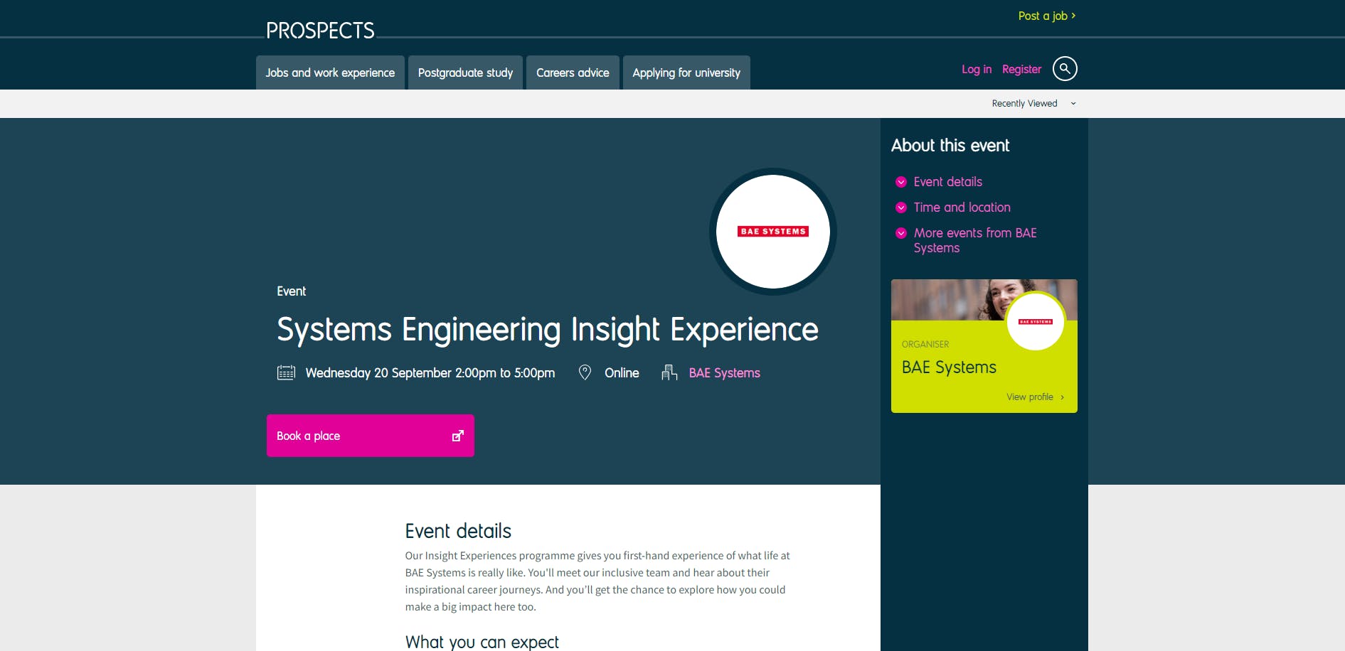
1. Minimum requirements:
- Start and end date
- Start and end Time
- Event title
- Location
- Online/Offline Event
- Booking URL/ Event URL
- Copy (Maximum 300 Words)
- Logo
2. Creative specs:
Logo:
- Max file size: 100K
- File type: .GIF/ .JPG
- Width x height required: 110x110 pixels
Masthead:
- Max file size: 200K
- File type: .JPG, .GIF, .PNG
- Exact dimensions required: 1140x300 pixels
Images:
- Max file size: 200K
- Exact width required: 620 pixels
- Cannot contain text
- Must not be transparent
2. Best practices:
• 1x event listing = 1 registration process. If an event advertised has more than 1 session/registration form, each must have a listing to accurately represent date and time for users.
Copy workbook
Try this Event Listing Workbook to draft your copy.
Branded solus email

1. Minimum requirements:
- Subject line
- Email header image (must not contain text)
- Content: Optimum 150 words, Maximum 200 words/two short paragraphs
- High res logo (in .JPG or .PNG File)
- Content images
- Text hex colours
- Audience
- Destination URL for button
- Call to action button
2. Creative specs:
Logo:
- High Res Logo: 72px and above.
- File type: .PNG, .JPG
Email header and content images:
- Minimum 600px wide.
- File type: .JPG, .PNG
- Must be readable on a 147mm screen
- Must not contain text
Videos and animated GIFs cannot be included in emails. These do not play 'in-email'. When videos are requested we can only include a screenshot of the still page of a video and insert a link to it. This is not advised.
If you don't want to build your own solus email, we can build your email for you.
If you require a colour scheme. Please provide hex colour values for the button and headline background colour. Alternatively, you can send a screenshot or image of an existing piece of your branding/advertising and we will do our best to recreate the colour scheme.
When supplying images, send the highest resolution and quality version that you have. We will resize and optimise images for email use.
The content area of both templates is 600px wide, so where possible, supply images that are wider than this.
3. Best practices
Copywriting guidelines:
- Users make a decision to click within five to seven seconds of opening an email. Therefore, copy should be limited to 150 words at optimum but a maximum of 200 words. Approximately two short paragraphs which are direct and to the point. Giving the user just enough information to want to click to learn more.
- Direct users to a relevant landing page with further information.
- Do not treat an email as a newsletter or information flyer as this will reduce the number of clicks as all the information is already in the email.
- Multiple links (For example multiple call to actions or multiple job listing links) and paragraphs within an email have delivered negligible results and should be avoided at all costs. This includes institutions sending out a single email with multiple links to various courses or jobs. Results show these emails are not engaged with by our audiences and should instead be broken into specific, relevant emails for each course or job vacancy.
- Subject lines should be specific, relevant and capture interest. Job titles and organisation names within subject lines have also proved to be more successful.
Visual/creative elements:
- Do not use images which include text as this is not responsive to device sizes and distorts when opened. The images should be supplied separately to the text you wish to overlay. Further Info: If a user has images switched off in their settings, the text in the header won’t show. This may lead to a drop in CTR.
- Images provided should be high resolution, aimed to be viewed on a 147m screen and maintain its resolution when viewed in desktop. To achieve this they should be minimum 600px wide.
Copy workbook
Try this Branded Solus Email Workbook to draft your copy.
Email - E-Shots

1. Minimum requirements
- Title of the email alert
- 40 words ONLY for the body of email
- ONE link the email alert should go to (internal for jobs, external for PG). Do not include this link within the body of the email
- Advertiser's logo
- Date email to be sent
- Any closing date to be added to the message
- Chosen audience criteria - can send a screenshot of AHS and/or list the criteria
2. Creative specs
Logo:
- Max file size: 100K
- File type: GIF, .JPG
- Width x height: 110x110 pixels
Spotify audio advertising
Advertising on Spotify combines audio and visual components. We use our knowledge and experience to craft the best possible advert.
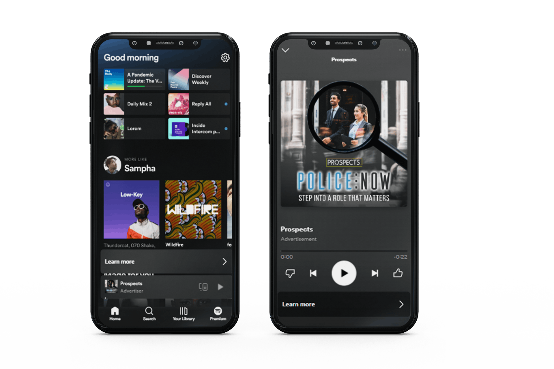
1. Minimum requirements
- 2-5 images (640x640px) which are brand approved, suitable for the advert topic (we will choose one of these which we think will work best).

- Logo - this must be a PNG version with transparent background as we will use this over the image.
- Brand font - to maintain brand consistency.
- Brand colours - hex colour codes of your brand
- Destination URL
- Message - Please provide in 65 words or less the message (including the CTA) you want to convey to your target audience. The number of words in the message cannot exceed 65. We will help you craft this if you need help. Based on the script we’ll build an audio ad with a voice-over and a background track (if it fits with the flow) for you.
- OPTIONAL - Your ad can use a background audio track. The audio can be your own or will be selected by our experts to best complement your ad. If using your own, the file must be MP3, WAV or OGG and it can play up to 30 seconds after the voiceover ends.
Examples of messages:
- Finding a career that aligns with your passions and strengths can be challenging. But with Prospects Job Match as your guide, it's easier than ever. Our platform provides personalised recommendations based on your unique personality traits, helping you find a fulfilling and rewarding career. Click now and let us help you find the job that's a perfect fit.
- Discover a world of new opportunities at the University of Brighton's postgraduate open evening on the 16th of February. Join us in Brighton to speak to students and academics from our accounting, business, events, finance, law, logistics, marketing and tourism courses. Explore what we've got to offer, funding options and how to make an application. Tap to learn more.
Once we receive this information, we will send you a proof of your advert. We will limit the amount of changes to the advert to two, so please take care to check the advert thoroughly.
Spotify video advertising
1. Requirements
- Recorded video meeting creative specs outlined below
2. Creative specs
- Aspect: Portrait 9:16
- File Types: .MOV, MP4
- Max file size 500 MB
- Resolution: Portrait HD 720x1280
- Max length 30 seconds
Journey/content widget
1. Minimum requirements
- A heading of up to five words and an accompanying explanatory sentence of up to 10 words
- Image: logo
- Destination link
- Start and end date
2. Creative specs
- High resolution logo
- White background
- No advert-style banners
3. Best practices
Make the best use of your copy - make sure the heading is enticing and highly relevant to the content appearing on your chosen page
Gradintelligence SMS and email
1. Minimum requirements
- 120 characters of SMS copy (Gradintelligence recommends aiming for a safe limit of 115 characters and use of abbreviations for organisation name, locations etc. where possible)
- 160 words of email copy
2. Best practices:
- Use commonly accepted abbreviations where possible.
- Use the candidates first name, this is more likely to generate interest.
- Include any compelling information, close date, financial support etc.
- Use same call to action terms used in the email, example ‘Apply now’.
- Avoid over-selling with terms such as 'fantastic opportunity'. Try to be clear, engaging and factual.

